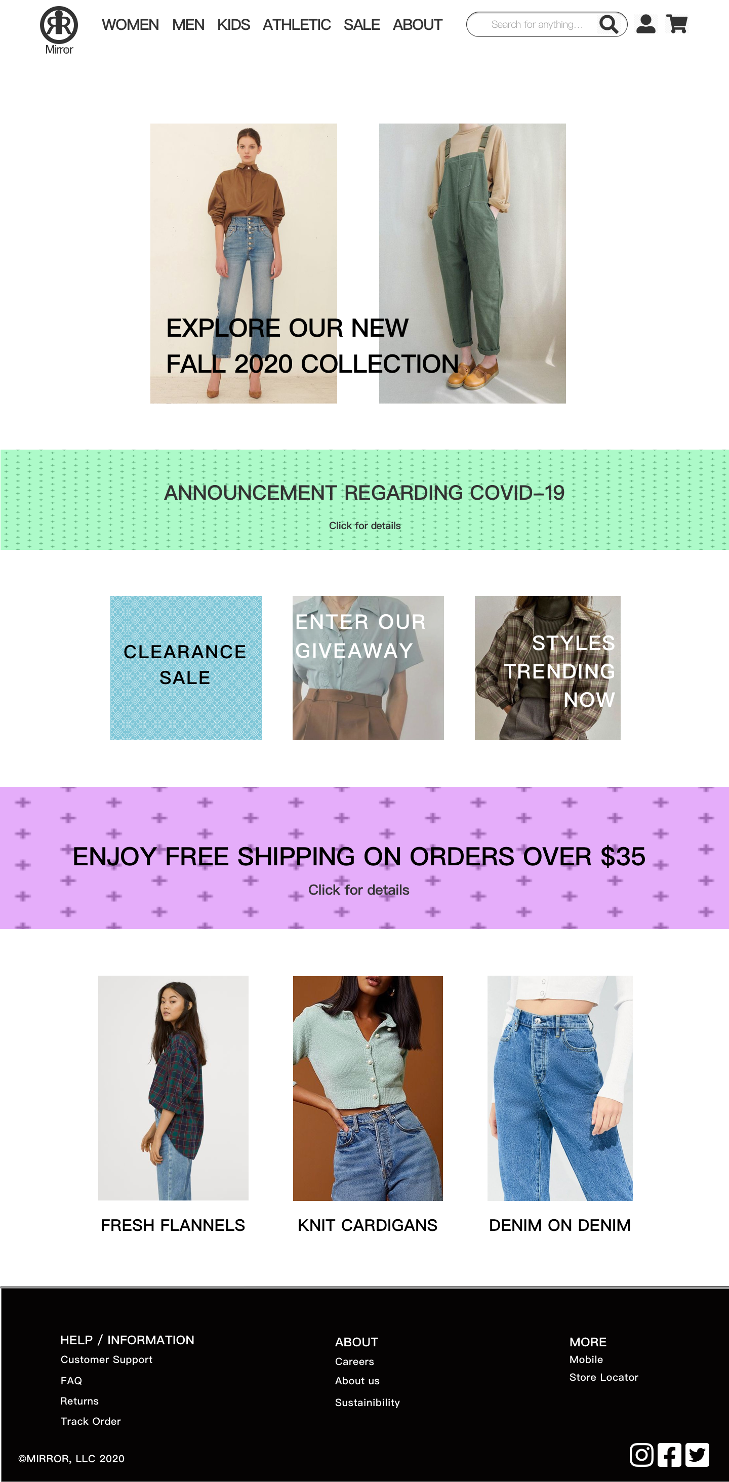
A website for a clothing brand that seeks to market to the ever-growing online user base.
MIRROR
Overview
Mirror* is an international clothing brand established in 1993, with over 400 stores across 32 countries worldwide. While they have had a lot of success offline, they wanted to expand into the online market, as the future of fashion seems to be heading in that direction. For this project, I conducted research, designed a website + logo, and made a prototype of a working website.
*Mirror is a self-started project.
Design Process
1. Research
Research and learn about the projected market and the users’ shopping habits
4. Prototype
Build a mid-fidelity prototype to use in testing with users
2. Define
Define and pinpoint the key ideas and questions learned from the first step
5. Test
Test with users to pinpoint pros/cons of design.
3. Interaction Design
Create task flows, user flows, wireframes, and responsive wireframes to use in creating a prototype
Research Goals
Learn about the pain points of users in the market
Determine direct competitors and their strengths / weaknesses
Project potential users’ browsing / shopping habits
Secondary Research: Market Research
Through conducting market research, I was able to understand the online shopping market and its users’ needs a little more.
Behaviors:
38% of shoppers admit to having returned an item they purchased or placed in cart if they received an email for a coupon on the same item.
With 63% of shoppers considering the return policy to be important, it’s no doubt that customers value a lenient and fair return policy.
Projected Market:
In the US alone, the projected market size for online shopping by 2023 is 300 million people, or roughly 90% of the population. Online shopping is quickly becoming the largest and most popular platform for shopping.
Direct Competitors
Primary Research: User Interviews
A persona was made using the the user interviews as reference.
Six users were interviewed about their experiences in online shopping in order to understand their needs and frustrations. From the interviews, the following information was gathered:
Goals:
For the customer to have an online shopping experience that is free of clutter and unnecessary functions; information should be easy to comprehend and not hindered by any elements that do not offer any new information or insight into the items
For the customer to find what they need and want as easily as possible via efficient, descriptive filters and an organized catalogue
Needs:
A well-organized catalogue
Accurate sizing
Consistency in wording
Pains:
Slow, unreliable customer support
Inconsistent / inaccurate sizing
Complicated return process / policies
Difficult to find deals / sales
Design: Sitemap
In preparation for the design process, a sitemap was made. A sitemap would be the base for all the design in terms of navigation moving forward.
Designing the website
Task flows and user flows were made in order to efficiently plan out the website’s pages and their respective functionalities.
Design: Wireframes
Low-fidelity wireframes were made to plan out the webpages and their layouts. Comments were written on the side section of each page in order to showcase the various functions in more depth. The focus during design was functionality, minimalism, and accessibility. A down-to-earth, simple website layout, as well as an easy to use menu was the primary goal.
Design: UI Kit
A UI Kit was made in making sure that the final designs of the website were cohesive, natural, and thematic.
UI Design
With all of the elements determined, I moved onto creating mid-fidelity wireframes for the website. This would be the final iteration of the design before moving onto the prototyping stage.
Desktop Prototype / Testing
With the wireframes completed, I moved onto creating a working prototype that would be used to conduct testing. This prototype would allow test participants and the designers to see how the website would navigate, as well as look for any potential flaws and mistakes before the development process. A test plan was made and subsequently used to conduct a prototype test in which participants were asked to navigate through a series of scenarios in order to decide how effective the website design was in assisting users through navigation.
Test Findings
The test findings were published into a document, as well as sorted into an affinity map to pinpoint the pros / cons of the website’s design. The affinity map consolidates and showcases the comments that the test participants had to say about the website’s design and navigation, as well as any other comments that they may have had in common with each other.
Iterations
The header / footer were changed to stand out more, as the previous design left little to be desired in terms of visual hierarchy.
The banners were changed to not take away from the vibrancy of the photos.
The color scheme was shifted to have more cohesion.
The overall sizing of the webpage was made smaller in order to fit smaller screens, such as a 13” Macbook Air.
Using the feedback and the research data from the prototyping stage, a small redesign was made to the homepage and subsequent pages to clean up the visual presentation and relaying of information.
What I Learned
Designing Mirror’s website and UX from start to finish allowed me to have a lot of practical practice in the design process. From the initial research to the design, as well as the prototyping / testing, I learned the importance of feedback and working with others. There were many times in which I thought that I knew exactly what the best course of action or design philosophy would be, but upon feedback from users and test participants, I found that there were better and more intuitive options to take.


