Overview
Whatsapp is a mobile application that connects users with their networks via individual and group messaging. As of the time of this project (October 2020), Whatsapp has a business app that connects businesses to users directly via its messaging service. However, the application is still lacking in some key functions, such as a payment function and a search / review function. Allowing users to have a fully inclusive and intimate shopping experience will require these two functions.
Design Goals
1.
Design a new search function for WhatsApp and rework the already existing Business Page design
2.
Create a review function for businesses in Whatsapp, similar to Yelp.
3.
Implement the use of QR codes in Whatsapp, similar to Kakaotalk (a Korean company)
Research: Defining the Key Points of a Multi-Purpose Social Media Application
Research was separated into two parts: market research and individual business owner interviews. Market research was conducted on applications similar to WhatsApp that are used around the world in order to determine what WhatsApp is lacking in terms of user experience. This research was compiled into two separate articles; one on WhatsApp’s lack of usage in the United States, where it is based out of, and one on the overwhelming success of KakaoTalk in South Korea.
The article dives into what makes KakaoTalk, WhatsApp’s South Korean counterpart, so successful in its integration into Korean culture, daily life, and accessibility. Using this information, I was able to pinpoint what changes might be needed in updating WhatsApp’s UX to further meet its users’ needs.
Research: Understanding the Demographic(s)
Individual Business Owner Interviews were conducted in order to determine what needs, goals, pains, and frustrations that users, as well as businesses using the app, have in regards to WhatsApp. Business owners were selected for interview out of their first hand experience in dealing with customers online. While the majority of users are not business owners, it was decided that business owners would be the most experienced in dealing with customers and users from online marketplaces and would understand the demographic more than the users themselves. These interviews were compiled into a document laying out the individual points and general consensus of interviewees.
The answers ranged in relation to the business owners’ experience levels and business type, but many of the core sentiments were shared between the three.
All three businesses use payment applications such as Venmo or Paypal in conducting business.
None of the participants have set up account pages on Google Businesses or WhatsApp for Business.
All three participants value customer service and communication, and expressed interest in a 1:1 messaging platform.
Two of the three participants were interested in WhatsApp for Business’s model, while one believed that it was unnecessary due to the various methods that customers already utilize in looking up businesses (Instagram, etc…)
Define: Pinpointing Users and Their Needs
Two personas were made using the information from both the market research and individual business owner interviews in order to further pinpoint the users’ needs, goals, pains and frustrations.
Joseph is a persona made of an individual business owner that uses WhatsApp for Business
Carly is a persona made of a user / customer
Organizing the New Features
As WhatsApp is already an existing application with established task flows and navigation, I was faced with the task of fitting in the new features while keeping what made WhatsApp intact. Using basic wireframes based on the already existing pages, I made a task flow and navigation chart with the new features added. This chart would be used to design the new pages and features with the navigation in mind.
Designing the New Features
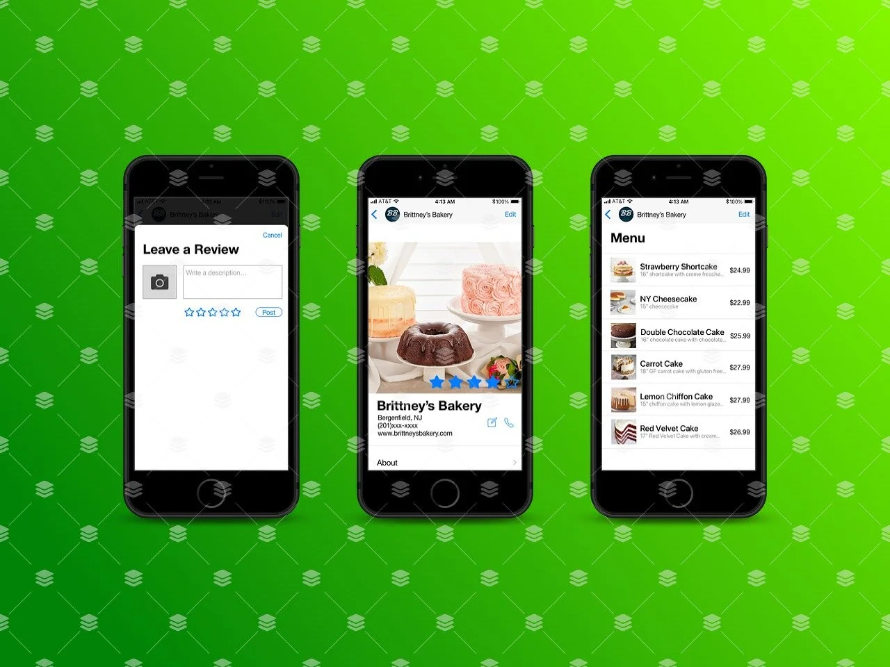
As design on the new pages began, wireframes were made using the WhatsApp UI Kit. A rework for the business page, as well as search and review functions were made. The business page was reworked to exclude some of the previously featured settings on the main page, and was changed to be more similar to a business page from Yelp or Google Business. The new page would include a review system, as well as change visual hierarchy in assisting users with navigation and overall user experience.
Prototype / Usability Test
The mid-fidelity wireframes were used to make a prototype through InvisionApp. The prototype was used to conduct usability testing to properly test new pages and functions in their ability to assist through navigation, as well as their overall design quality and effectiveness.
Test Results
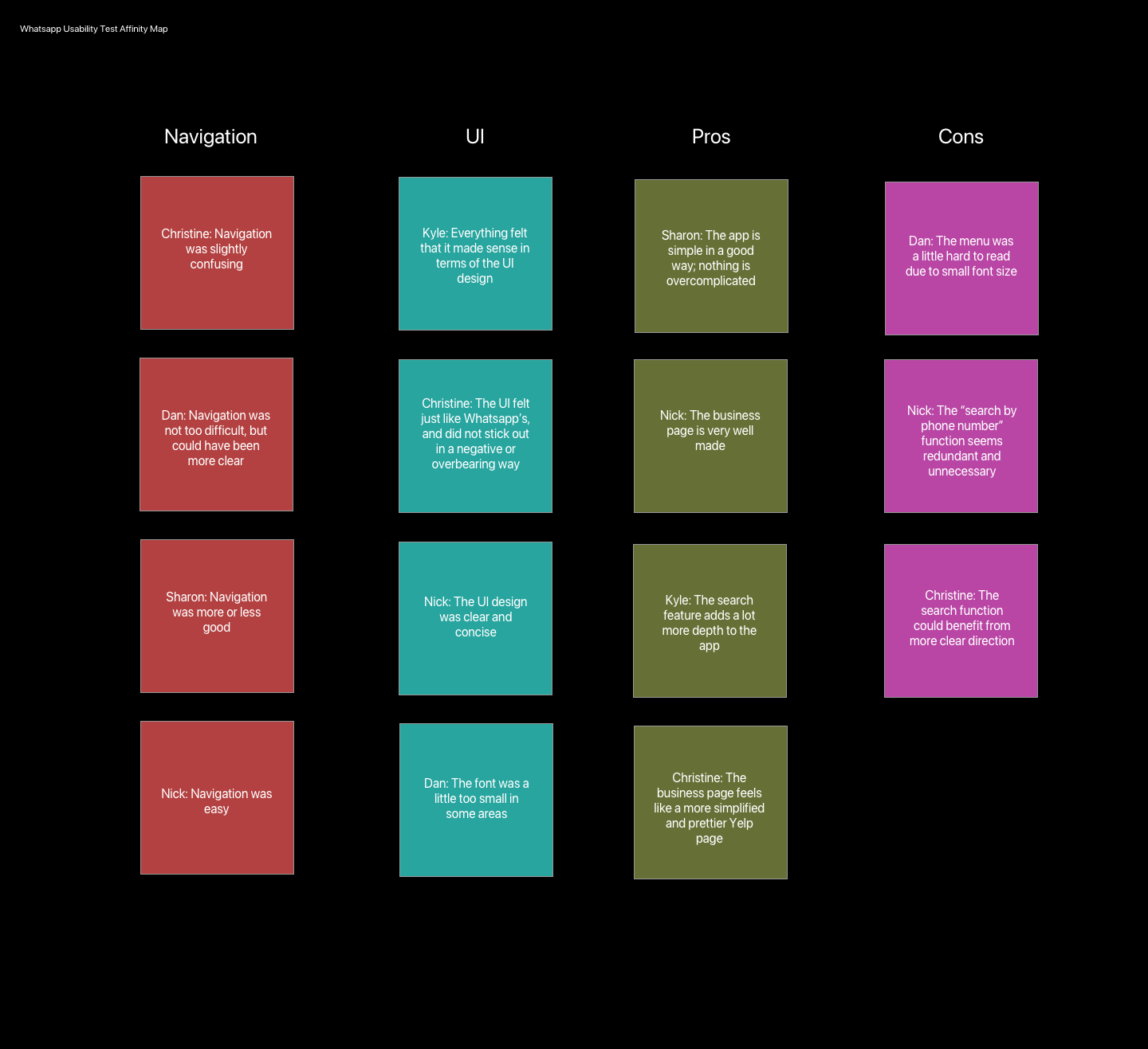
The results from testing were compiled into a document that recorded what the positive and negative points were about the app in its current form. Participants’ comments were used in making an affinity map in order to determine what commonalities and particular comments were being made. The main concerns that test participants had were in the realm of design, as some fonts and text were hard to read due to improper sizing or color choices. Almost all of the participants had no issues in terms of navigating the new features, and praised the visual design of the new pages.
Iterations / Learnings
A few changes were made to the review and menu pages in order to assist with navigation / make for more ease of access for users.
As this is not an official project from WhatsApp, there will currently be no further work to be done.
A lot was learned throughout this project. For starters, I was able to learn what it means to truly add to an application while not taking away from the core values and principles. I was not a fan of the UX design of WhatsApp. However, I understood that if I changed too much of what made WhatsApp the number 1 social media application in the world, many existing users would become disinterested and/or alienated from the product. Making sure that the changes made were of the highest priority and impact with a minimal amount of confusion was the biggest priority of this project.


